Friday, February 20, 2009

Form and Content 3

This is an illustration for an article about the money management of humanitarian foundations in the world for the New York Times.  The designer's name is Lorenzo Petrantoni. He wanted to bring back the style of old book illustrations, and to tell the story from beginning to end with one graphic.

I think that he explored a great deal of texture and pattern in this image. The composition is very strong as it leads your eye around the image.  The varying thickness of the text in vertical and horizontal lines is interesting to read.  The strong bolds draw you in first and then lead you to read the smaller text around it. The text also forms wrap around style around the graphics in the image.  I believe there is also a use of some kind of Dingbats around the edges of the words to make it look more like art than text. The black and white colors are very bold. However, there's a ragged edge to the letterforms that make them look worn and more like a newsprint graphic than a book graphic.  I also think that the rag edges of the image make it overall more appealing than if it had aligned edges.  I think that this is a very cool piece, almost like a page from an iSpy book.  

32948_7_0_LTc4Njc2MDEyMzE4MTAxNTkxNjc.jpg

Thursday, February 5, 2009

Form and Content 2


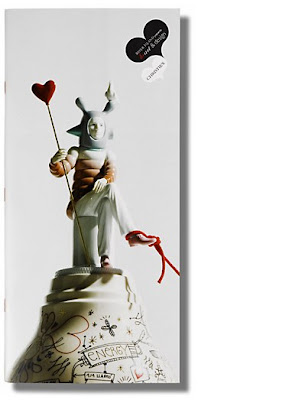
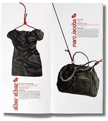
For my second form and content, I chose this piece from the Communication Arts website to write about.  The piece is called 'Heart & Design auction catalog.'  This catalog was put together by Frost* Design in London to support the Royal Brompton and Harefield Hospital.  The items in the catalog were donated by their designers.  Some included: Marc Jacobs, John Galliano and Karl Lagerfeld.  These items were auctioned off for the cause of heart and lung disease research.

I really like the layout of these pages.  The color scheme of white, black, and red that they chose is very strong on the item pages.  They also chose to put hearts as a design element and that makes sense.  I thin the way that they chose to type each designer is very bold.  I love how they wrote it vertically and made the font color red.  That puts more emphasis on who donated the item instead of what the item actually is. My favorite layout pages are the Marc Jacobs handbag and the Studio Job necklace because the straps and the necklace lead your eye around and off the page.